Design internship: RBC Mobile
4-month Internship @ Royal Bank of Canada
Visual Design, Mobile Design
Tools: Sketch, Ziplin, Jira
Duration: 16 weeks
Date: May, 2018 - Sep, 2018
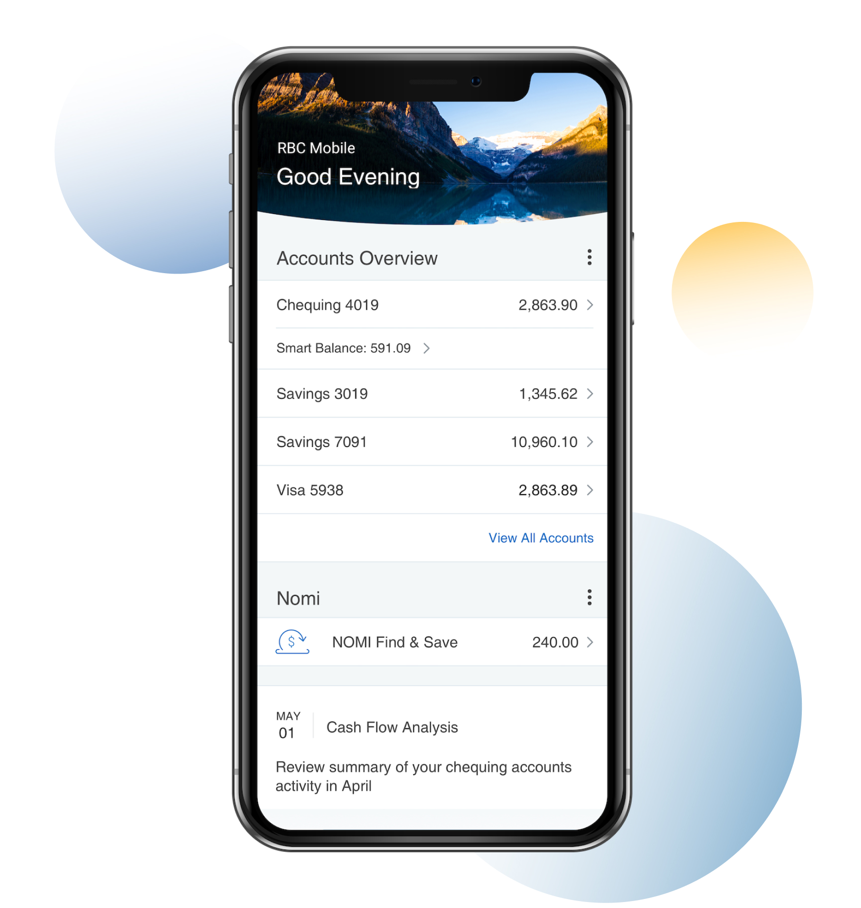
During my 4 month in RBC mobile, I primarily worked on UI components for RBC mobile 2.0. I reorganized and deconstructed a series of UI components following the principle of Google Material Design.
Overview
During my 4 months in Mobile Banking, I contributed to the release of Mobile 2.0 through new component library’s development and management, screen productions for new projects, defining UI specs for development team and creating mock-up screens for user tutorials.
This case study explains my work around new component library.
Project Brief
We wanted to develop a new library system that safeguards our visual standards and streamlines the workflow for both in-house productions and external cooperation.
Main Steps - Plan

Audit
Ship
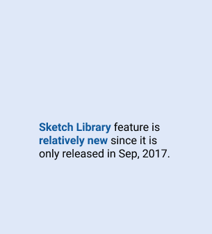
01. Research Sketch Library
Goal: to measure the advantage of utilizing Sketch Library feature against the cost of time and labour & to evaluate the potential turbulence caused by this intervention.
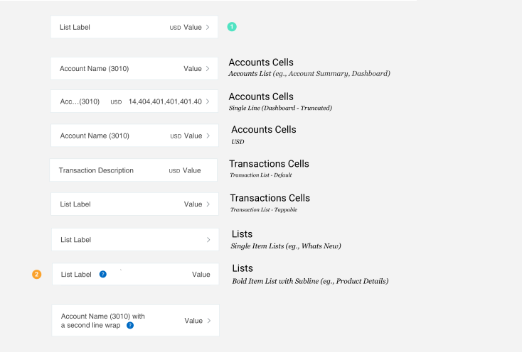
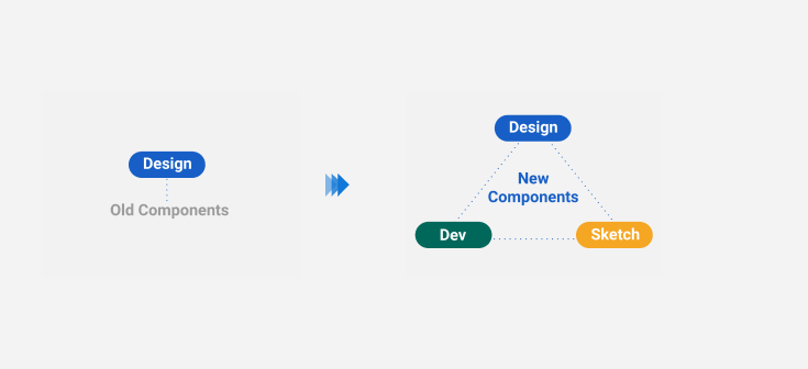
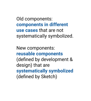
02. Study Existing Components
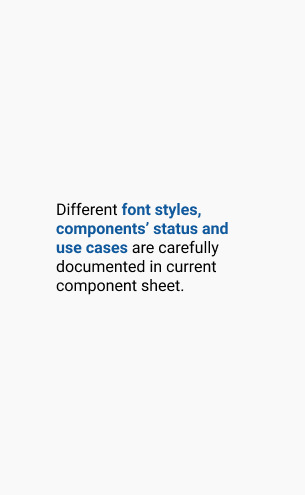
To learn the current component library structure and how components are created, modified and documented.
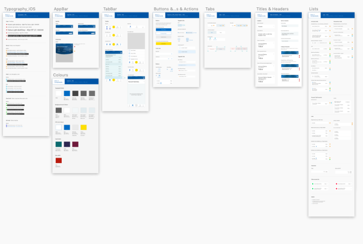
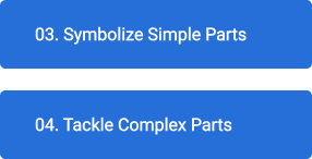
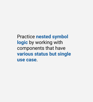
03. Symbolize Simple Components
To apply nested symbol logic on components that have various status but single use case.
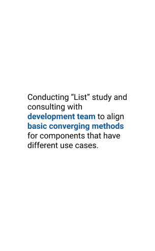
04. Tackle Complex Components
To unify components in variations into one reusable nested symbol.
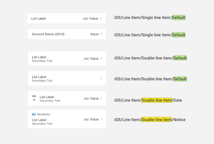
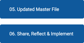
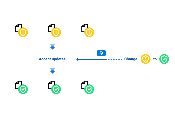
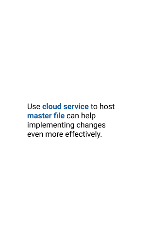
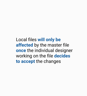
05. Updated Master File
To symbolize components based on the logic discussed above and package them with icons and text styles.
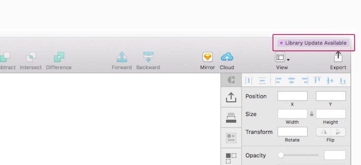
icons and text styles are imported and organized with newly introduced naming convention. (so when a icon change then all components using this icon will get changed)
- icons/more menu/NOMI
- icons/more menu/Tools & Calculator
- icons/more menu/NOMI Find & Save
- icons/more menu/Help
- icons/more menu/What’s New?
- icons/more menu/Open Account
- icons/more menu/Alerts
- icons/more menu/About RBC Mobile
- icons/more menu/Find Us
- icons/more menu/eStatement
- icons/more menu/Manage Credit Cards
- icons/more menu/Linked Accounts
06. Share Reflect & Implement
To share all progress with the design and development team, as well as others who may concern.
Reflection:
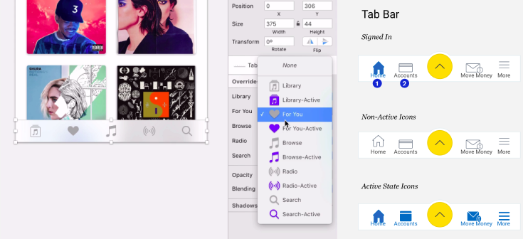
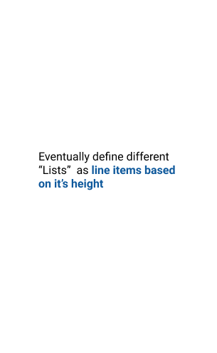
As my time in RBC is limited, I was not able to symbolize everything before I leave. The library is 80% finished with functional symbols for AppBar, TabBar, Tabs, Buttons, Header, Lists. (Errors and Expanders are not finished). In addition, all symbols are embedded with global icons and text styles.
Acknowledgement:
Thanks to Jason Mills for bringing me onboard, Ali and Rida for your continuous support and trust. Thanks to Greg, Brian and Michael for your valuable advice and encouragement. Thanks to Mobile Banking design and development team for your collaborations and understanding.